Published on .
You can’t manage what you can’t measure is a tried-and-true mantra for enterprise leaders everywhere, and for good reason. Full visibility into processes, performance and outcomes is absolutely essential for making improvements and reducing unwanted variability in services.
But understanding what to manage—or even what’s most important to measure—isn’t easy for population health leaders, especially those with complex, high-risk, high-spending members to think about. The healthcare ecosystem is steadily getting better at identifying and aggregating high-value data, yet organizations still struggle to gain valuable and useful insight from that data: information that opens up tangible opportunities to foster better health outcomes and reduce future medical spending, as well as better experiences for the people they serve.
That’s where data visualizations come in. Engaging and intuitive data dashboards are a critical tool for organizations looking to make the most of their informational assets. By incorporating multisource data sets and customizable data visualization into risk stratification activities, they can generate insight into the “prism” of risk and gain a new perspective on the many interconnected clinical and socioeconomic factors that influence a member’s health status.
The power of understanding and stratifying risk
Stratifying members by risk is a fundamental competency for conducting population health management activities. To develop effective and relevant interventions, organizations must first ensure a deep and comprehensive understanding of the clinical and non-clinical factors that combine to create health and wellness burdens on their members. Some of these factors may include:
- The number and type of chronic diseases and comorbidities experienced by a member
- Utilization and spending rates, including high usage of ER (emergency room) resources and avoidable hospitalizations or re-admissions
- The number and type of medications each member is using
- Medication adherence rates and drug therapy problems (DTPs)
- Access to care for specific provider types (e.g., primary care, specialty care, behavioral/mental health care or pharmacies)
- Socioeconomic vulnerability levels for the neighborhood in which the member resides
These risk factors may vary widely for populations in different geographic regions, income brackets and racial/ethnic backgrounds, which means that one-size-fits-all clinical and socioeconomic interventions won’t be an efficient or effective use of resources.
Instead, organizations need to group members by shared characteristics—otherwise known as “risk scoring”—and design tailored strategies for each identified level of risk. Lower-risk individuals may be able to change their health trajectory with less intensive outreach or monitoring, while the most complex members may require significant ongoing care management to control high spending and improve outcomes.
The role of data dashboards in visualizing risk management
Raw data doesn’t tell lies, but it also doesn’t speak as loudly as it could. Data visualizations take member population data and clinical concepts and arrange them in a narrative way that population health leaders can harness to easily understand more about population health and risk. By using shapes, colors, lines and spaces to tell a complex story in a simple way, visualizations help end users consume information more quickly and engage with insights more fully.
This is particularly important for care managers, clinicians and other members of the outreach team when they are trying to prioritize their highest-risk individuals for appropriate interventions. At-a-glance insights are essential when connecting with dozens of members each day, making it easier to understand exactly what factors to focus on during each conversation.
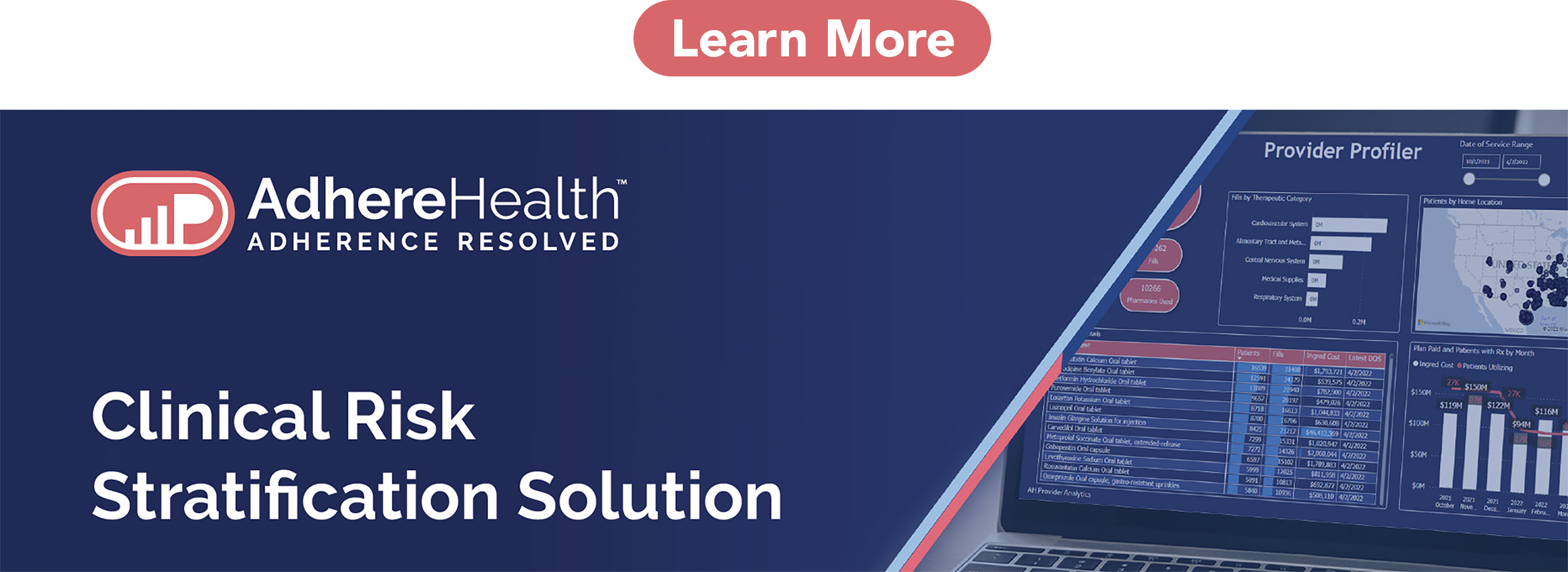
Visualizations are also essential for enterprise leaders taking a macro view of the group’s population to allocate resources and monitor the effectiveness of care management activities. Data dashboards must be able to answer a wide range of questions and should be customizable enough to offer granular insight into very specific queries, when necessary. That means going beyond the basic ability of sorting a member population’s overall risk scores from high to low, or generating a geo map of high-risk patients by using their addresses.
Features of a robust risk stratification dashboard solution
 A truly powerful data visualization platform will be able to go further than basic risk stratification. For example, it’s valuable to be able to provide information indicating gaps in care, such as suboptimal medication utilization, and incorporate non-traditional datasets (for example, the CDC Social Vulnerability Index) into risk stratification outputs.
The most advanced data dashboard tools can even stratify risk within the context of variables that are most important to a plan for answering a specific question. This allows users to calibrate the weighting of certain contributing factors and generate customized risk scores for a selected population or member, plus member outreach lists to maximize engagement efforts.
In these ways, groups can leverage risk stratification for customized and targeted population health management activities that produce the most impact for at-risk members—reducing care gaps, improving medication adherence and reducing spending associated with improved health outcomes.
Leveraging the “risk prism” to generate tailored member insights
A “risk prism” refers to a novel way of viewing an individual’s risks and opportunities by creating a customized blend of data points that are of special interest to an organization. By shifting the weighting of each component risk factor, plans can identify individuals falling short on specific goals, such as spending on avoidable utilization or medication adherence thresholds—and intervene accordingly.
For example, one team within a health plan may be most interested in how a high number of comorbidities and medication counts relate to spending for a given population. Meanwhile, another user might be interested in understanding the role of social determinants of health (SDOH) in medication adherence, and may wish to shift the overall risk score weighting in that direction.
This gives plan leaders much deeper, richer access to information about what the real-world member journey looks like and how certain segments of the population experience the impact of well-defined issues that may contribute to suboptimal outcomes. Breaking through to this layer of insight can support health equity initiatives, resolve gaps in care and identify rising risks earlier before they balloon into expensive, harder-to-treat health issues.
By using a data visualization dashboard to make risk stratification more accessible, engaging and intuitive for users, MA plans can begin to take a deep dive into personalized risk scoring and precision with interventions. Harnessing the power of robust risk stratification can help population health leaders identify areas of opportunity to improve engagement and health outcomes, thereby reducing the spending associated with chronic or untreated health concerns.
To learn more about how AdhereHealth’s risk stratification dashboard solution can help your organization create your own “risk prism” to guide population health management initiatives, download our sales brief or contact us today for a consultation.