Published on .
Health plans today are swimming in an ocean of data—claims data, pharmacy data, member engagement data and more. But with so much information available, how do organizations turn these vast data sets into meaningful, actionable insights?
In our recent Solution Spotlight webinar, Taming the Data Beast: Simplifying Health Plan Analysis for Better Outcomes, we explored this challenge and how AdhereHealth’s innovative data visualizations help health plans cut through the noise. If you missed the live session, you can now watch the on-demand replay.
The Golden Age of Data—and its challenges
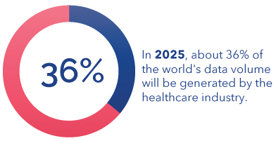
As Dr. Levi Sanderson, Sr. Director of Clinical Solutions at AdhereHealth, pointed out, we are in the “golden age of data.” With the healthcare industry generating an estimated 36% of the world’s data, health plans have access to more information than ever before. However, this influx of data also presents a significant challenge: efficiently managing and interpreting it to drive better member outcomes.
Many health plans still struggle with outdated data management systems, fragmented data silos and time-consuming manual processes. As Sr. Director of Reporting and Analytics, Adam Bartusewich explained, “These inefficiencies make it difficult to extract insights from raw pharmacy claims, assess population health risk or take timely action on member needs.”
Turning data overload into actionable insights
Recognizing this challenge, AdhereHealth developed its Adhere PlatformTM data visualizations, a suite of interactive dashboards that simplify data analysis and empower health plans to make faster, data-driven decisions.
These purpose-built visualizations provide:
✅ High-Level Executive Summaries: macro-level insights that quickly convey overall performance to leadership teams.
✅ Operational-Level Metrics: deeper analysis for program managers tracking trends in member engagement and population health.
✅ Patient-Level Details: drill-down capabilities to view individual member interactions, outreach efforts and engagement outcomes.
By organizing data into three distinct levels of specificity, health plans can seamlessly navigate from big-picture trends to granular details, ensuring that insights lead to meaningful action.
A look inside the Adhere Platform
During the webinar, the presenters provided a walkthrough of the Adhere Platform’s data visualization dashboards, demonstrating how these tools help health plans streamline risk assessment, optimize engagement strategies, and improve both clinical and financial outcomes.
With real-time insights and intuitive visualizations, users can quickly identify trends, uncover key cost drivers and make more informed decisions—all while reducing the time spent manually sifting through spreadsheets and raw data.
Watch the webinar on-demand
If you’re looking to simplify your health plan’s data analysis and drive better outcomes, you won’t want to miss this webinar replay. Watch the full session here to see how AdhereHealth’s data visualizations can help you “tame the data beast” and turn information into action.
